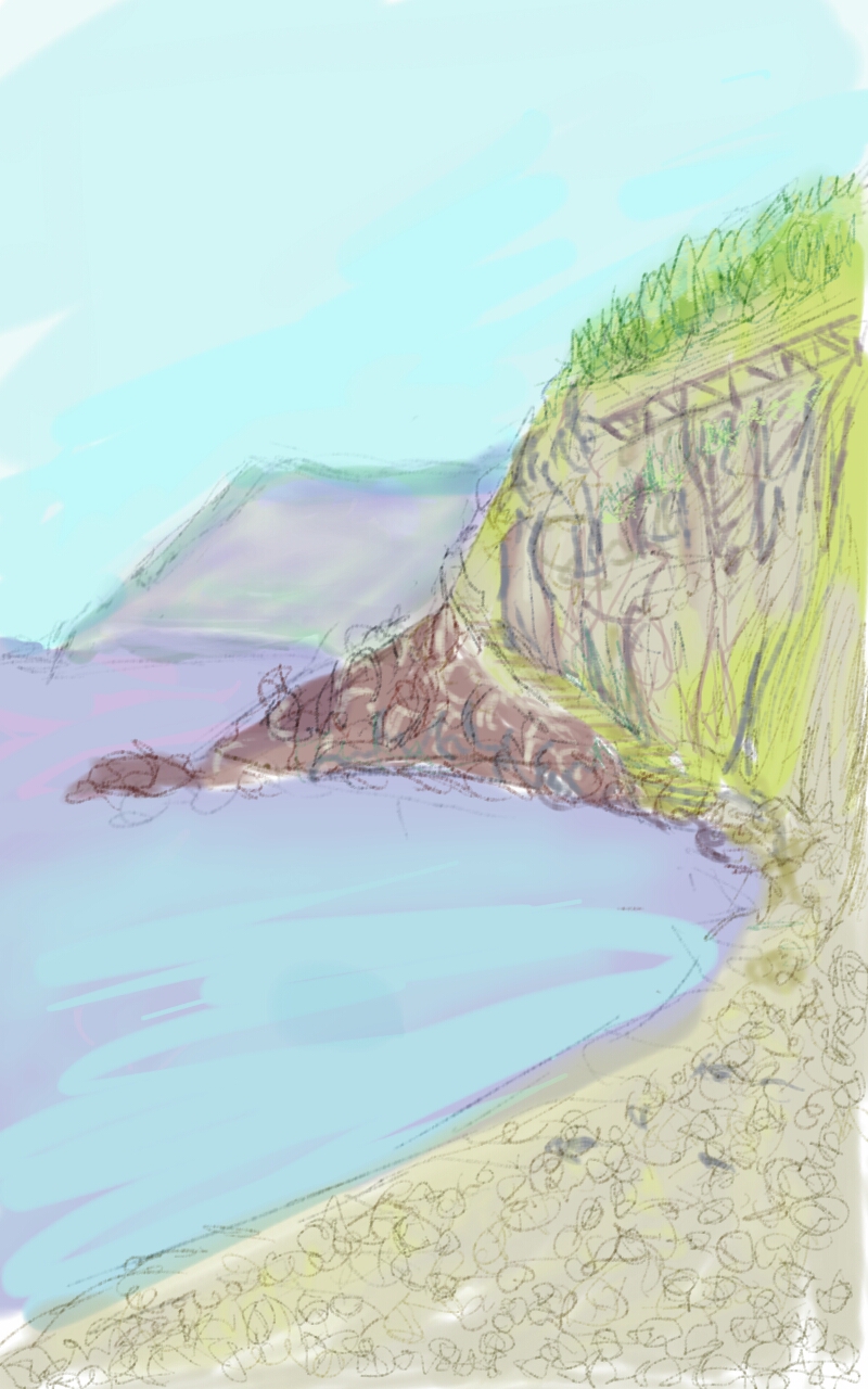
Friday, 11 September 2015
Riomaggiore digital
Hay ya!! Here I introduce a digital sketch of a landscape made during a recent trip to the Cinque Terre. Here I was in Riomaggiore, the first of the villages on the sea of this handsome region. It's really rough and it'd need a lot of refinement..the colors are quite different according to the screen. I'm not confident with the software yet. This is done with Sketchbook pro.


Tuesday, 25 August 2015
Plen air sketch: Monte Albano
Here's a recent plen air sketch. Done in watercolor on spot in about 45 minutes. A child and his father stopped by me while I was sketching. The child was curious, and was also full of question which is a great thing I think... the photo has an uneven lighting because some sun rays were filtering through the branches of the pines. The dimension is about 20x15 cm on Fabriano watercolor paper.


Thursday, 20 August 2015
Train sketches 4
I share some sketches I made on the train. What's new with these? I made them with Autodesk Sketchbook Pro ® for android, on my new tablet Samsung Galaxy Note 8 ®.
Monday, 10 August 2015
From an advertisment
This is quite old drawing. This come from 2010, the time of the drawing course. I copied a picture from a well-known commercial.. I hope I'm not violating some rule here >_<
I used charcoal pencil for the rocks. Chalk sticks for sky and water (only few primary colors), sanguigne and sepia pencil for the red rocks. I think also some touches with few oil pastel, diluted with turpentine. I tried to reproduce the fog effect with white pastel, but only got a burnishing effect. I forgot the boy is in marker.

I used charcoal pencil for the rocks. Chalk sticks for sky and water (only few primary colors), sanguigne and sepia pencil for the red rocks. I think also some touches with few oil pastel, diluted with turpentine. I tried to reproduce the fog effect with white pastel, but only got a burnishing effect. I forgot the boy is in marker.

Monday, 3 August 2015
Drawing Course 3
Hallo!! Welcome to the third lesson!! Today another good exercise I made in my first drawing course. You need a pencil, better a couple or three (I had HB, 2B, 6B at that time). Perhaps you can do it also with mecanical pencils too. And you need time and patience: I think, it took me 6-8 hours to do this, maybe 10. Don't hurry!! Stick on't!!
Another time this is "life size", in the sense that the drawing is the same size of the model. We had copy af an engraving, but I don't remember the author. You could complicate the exercise making the drawing a scale of the model: double time bigger, or smaller, or even a third bigger. This is no fun for me but it forces you to become more acquainted with measuring, and it also sharpen your scaling ability. For me the best part is rendering, so I simplified the drawing part.
Still today I think that I should go back and revise the measuring technique, make some paintaking life drawing measuring everything.. but hardly ever I keep this aim..
I suggest not to go as you can; work middle tones, layer after layer. Usually it's better a light sign than a heavy one. Of course you can go darker then...
Another time this is "life size", in the sense that the drawing is the same size of the model. We had copy af an engraving, but I don't remember the author. You could complicate the exercise making the drawing a scale of the model: double time bigger, or smaller, or even a third bigger. This is no fun for me but it forces you to become more acquainted with measuring, and it also sharpen your scaling ability. For me the best part is rendering, so I simplified the drawing part.
Still today I think that I should go back and revise the measuring technique, make some paintaking life drawing measuring everything.. but hardly ever I keep this aim..
I suggest not to go as you can; work middle tones, layer after layer. Usually it's better a light sign than a heavy one. Of course you can go darker then...
Friday, 31 July 2015

Thursday, 23 July 2015
Drawing course 2
Here it is the second lesson. Unfortunately, we left life drawing and we began to draw from scruffy copies. But this was exhalting anyway!! And I was able to practice at home.
This is an etching from Giorgio Morandi

This is an etching from Giorgio Morandi

Wednesday, 22 July 2015
Drawing Course 1
Aye!! Today I want to post some very old drawings. To tell the truth... they are the first after a long time. In fact that's the drawing course which turned on the passion for drawing and painting...after the long sleep after the middle school courses. Ahh.. such a sweet time... It was the beginning of 2010. To tell the truth the passion for art was instilled after I took up a course in pottery.. but that's another post.
Monday, 20 July 2015
San Miniato
A windy day. 8th March 2015. Still cold, even if you can see the coming of the spring in some buds and and canes. I was able to see white rushes and the snow on the far Appenine. I went to Corniano, on the southern side of San Miniato, with my new Schmincke Horadam watercolour.

I know.. The city with the famous stronghold isn't in my sketch... but it won't be the first time that I ignore buildings... Maybe I need more patience and precision, and I relax at best with painting natural object. But it could be a field were I pick up. And also I could try to paint the tower and the town someday.. Let's notice: too color density on the near hill. But I had to test the glazing with this strong watercolour brand. You can get almost a guache effect, and that's good for me, but need practice obviously. Pehaps, for the sake of watercolour, it's better to stay away from high density, but I think that finally the attention is focused on San Miniato hill, and that's not bad, because we have a stronger subject.

I know.. The city with the famous stronghold isn't in my sketch... but it won't be the first time that I ignore buildings... Maybe I need more patience and precision, and I relax at best with painting natural object. But it could be a field were I pick up. And also I could try to paint the tower and the town someday.. Let's notice: too color density on the near hill. But I had to test the glazing with this strong watercolour brand. You can get almost a guache effect, and that's good for me, but need practice obviously. Pehaps, for the sake of watercolour, it's better to stay away from high density, but I think that finally the attention is focused on San Miniato hill, and that's not bad, because we have a stronger subject.
Thursday, 16 July 2015
REFLECTIONS & Some sketches in the field
Here are some sketches of 2014. I'm not particularly proud of them, perhaps I shouldn't post this (and the photos are horrible too), I could make an effort on it); but I think that this can be tought and said for every post. So I will tell the world this sketches, but mostly as a "backup" sketchbook. Maybe is cushier to collect picture here, I can see what are the worst part and think about correction, and also I can contextualize the picture, and evoke a particular mood without having the need of looking up the originals spread out somewhere in some drawers. I hope this will help me keeping motivated. If you have any comment or critics... feel free to post!!
Present for a collegue
Sometime ago, some year actually, a collegue saw a drawing of mine in wich was portraited a woman. That woman had a scarf on her had; the collegue was very fond of the picture and I gave her that little pen sketch. After some year, in wich our paths have risked to fallen apart, we are together again, not in the same office but near. So she asked me to make a St. Joseph, beacuse that scarfed woman reminds her of St. Mary. So, after some research, I found a Rembrandt's pen sketch wich was a study for a St. Joseph. I made a copy for her but also a photo (and a copy) for memory.
Here it is..

Sepia Pitt Pen on a watercolor base of ochre and burnt umber.
Here it is..

Sepia Pitt Pen on a watercolor base of ochre and burnt umber.
Figure drawing at FAA
Another Figure drawing of May 2015. Experimenting with Blue pencil, like the ones used for comics. The blue is cool, more vibrant Nevertheless not enough contrast for value, but the model was good for anatomy.

and a further step

Critique: usual trouble with feet. More attention to line weight and economy. Not satisfied with middle tone espressed with volumetric line. The core shadow on the left shoulder is ugly...

and a further step

Critique: usual trouble with feet. More attention to line weight and economy. Not satisfied with middle tone espressed with volumetric line. The core shadow on the left shoulder is ugly...
Subscribe to:
Posts (Atom)